“People ignore design that ignores people.”
– Frank Chimero, Designer
All good design exercises begin with the end in mind. Human-centered design takes this adage a step further, asking: but what does the user desire? Knowing that answer is key to unlocking app adoption.
What is human-centered design?
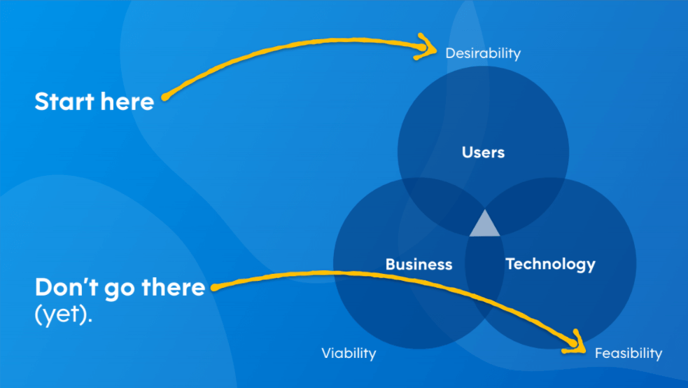
Human-centered design sits at the intersection of user desirability, business viability, and technical feasibility. While all three traits are indispensable to creating experiences users love, you must first understand what people desire.
You can have 100% overlap between feasibility and viability and still build apps that nobody uses.

Human-centered design places the customer at the center of every process. It seeks to understand what the user wants and needs to do their best work. When planning any app or experience that’s focused on the user, consider these aspects of “big D” design:
- Utility: can the user accomplish tasks with the app to reach their goals?
- Efficiency: can the user perform work faster than with the available alternative solutions?
- Clarity: can the user quickly see how the app works and use it without training or consulting a manual?
- Delight: does the visual appeal of the app inspire confidence in both the tool and the people who crafted
Too often, companies correlate poor adoption with people’s aversion to change. Yet, users are actually happy to shift the way they do things or the tools they work with if it’s for the better.
By employing human-centered design in your app development process, you can increase app adoption and facilitate positive organizational change. But don’t just take our word for it.
Human-centered design success stories
Nintex customer GolfNow realized their technology was standing in the way of time spent with customers. The company’s process required that users enter data in multiple places, consuming too much time.
With just two Salesforce admins using Nintex, GolfNow designed and deployed multi-functional list views and detail page layouts for their org of over 1,800 users.
This update transformed how GolfNow manages, views, and enters data, making a more streamlined UI for every team. The net result? A simplified operational process that meant employees could spend less time entering data and more time doing what matters.
Michael Barnes, Director of Salesforce.com Administration at Golf Channel said, “We have three and a half million golfers who now have a frictionless booking experience on the GolfNow platform and book at over 6,600 courses worldwide.”
Another Nintex customer, Modular Walls, built a unique Configure/Price/Quote (CPQ) experience that addressed the pains of both its salespeople and customers.
Imagine buying a fence for your home for the first time. With so many options and considerations, it would be hard to know where to start. And, as a salesperson, walking a prospect through a list of technical specifications without any visual aids is a tall order.
Using Nintex, Modular Walls created a CPQ tool that both helps customers gather all the information needed to generate a quote and shows them what a fence would look like, before they even speak with a salesperson.
The Modular Walls Quick Quote Calculator takes care of it all: how much coverage you need for your property, what kind of materials you want to use, how tall you need the fence to be, and what local regulations you need to know.
This tool allows Modular Walls to deliver customers a slick, Apple-like experience that’s mostly unheard of in the construction industry.
Kyle Stewart, systems architect for the app said, “The highest compliment I’ve ever got for this app was that it works best on mobile, because whoever thinks something works best on mobile?”
Want to learn more about what Nintex and human-centered design can do for you? Request a demo today!


