Gartner says, “Every year, poor data quality costs organizations an average $12.9 million.”
Online businesses depend on humans typing massive amounts of information into web pages. Forms are a key function for capturing critical data, but all too often, they’re lacking when it comes to quality user experience. If you want to get the data you need, you must make the process as seamless as possible.
Additionally, users demand forms that are perfectly customized to their needs. Taking a human-centered design approach will help. Putting the user first when creating forms or apps of any type can increase user satisfaction, ROI, and help you capture the data you need without hassle.
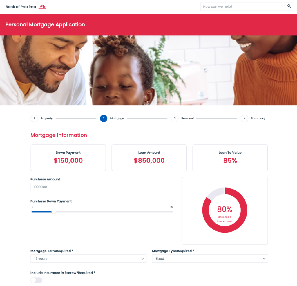
Recently, Nintex Apps, previously known as Skuid, helped a regional bank move a loan application process online. This complicated data entry process had to be done correctly to ensure the quality of the financial transactions. It also needed to be done securely. With Nintex Apps, you inherit security credentials from the source of record, making it a trusted and secure option for organizations with strict security requirements.
Using a human-centered design approach and a design-led execution model, the customer used several key Nintex capabilities to facilitate a high quality experience for this loan application. Here are some of the principles we employed.
1. Don’t present the user with unnecessary questions.
In any complex process, there will always be data elements that aren’t relevant for particular scenarios. For instance, if you’re applying for an FHA loan versus a conventional one, not all questions will be the same.
Nintex makes it simple to conditionally render components based on other data. These components can be fields in a form, or entire sections of a broader workflow.
2. Focus the user on “bite-sized” chunks.
To start, you should only expose a small set of questions at any given time. Break up the form into chunks that will allow the user to take breaks and not feel overwhelmed when going through the process.
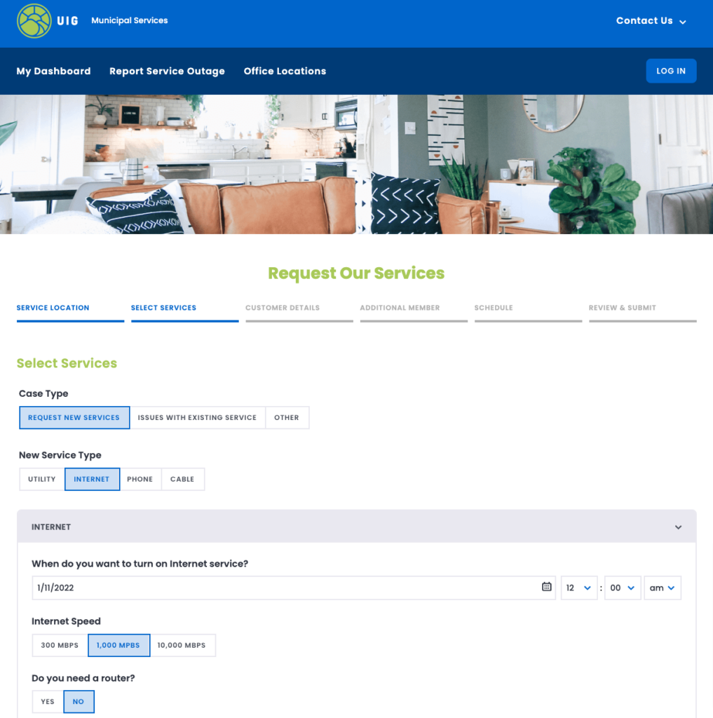
Nintex Apps provides tools like wizards and accordions that allow you to structure an experience in a set of steps. Nintex also makes it easy to configure buttons that move the user through a set of questions, and even expose sections conditionally so you can develop custom workflows.
3. Show the user their progress.
Users are encouraged when they can see their own progress toward completion. For instance:
- Visually indicate that a section has been completed.
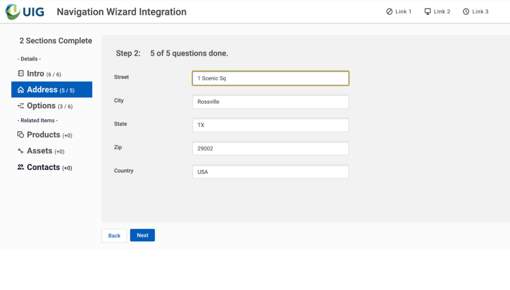
- Show how many questions have to be completed in any one section.
- Provide global indicators of progress made and effort remaining.
UX resources for multi-part forms
If you’re interested in how Nintex Apps might make these principles a reality for your forms, here are some resources worth checking out.
1. Two public demos that showcase intuitive multi-part forms


2. A Nintex Apps sample page
We recently published a Nintex Apps page that shows some advanced techniques working together to deliver an effective multi-part form experience. You can download this page and see how it works. Check it out here.

Technique examples include:
- Integrating vertical navigation selected state with Wizard button actions. This allows use of our vertical navigation component to show “current step” regardless of whether the navigation elements are actually clicked. The user can click the navigation elements or the wizard buttons to move around in the form. The correct step of the wizard is opened and the correct navigation element is highlighted.
- Dynamically updating question counters and general status indicators in the UI. As users complete questions, UI-only fields can be recalculated and components can be instructed to listen to those changes and be refreshed. This provides users with immediate feedback on progress through the form.
With Nintex you can make multi-part forms easy to use and improve the quality of your data.


