While navigating through a website for a financial institution, I stumbled upon one of their forms to collect user information for one of their processes. Finding the form was not difficult, but the form was long, often asking for information that did not pertain to the request I was trying to make.
Once I finished filling in my information, I then experienced submission errors due to fields not containing data, even though the errored fields were not labeled as required. The process became time intensive to the point where I had to contact the financial institution on the phone.
This experience could have been easily avoided if proper form design was used, ensuring greater customer satisfaction and a faster time to completion for the customer to start the process.
Luckily, Nintex Forms makes form design easy, and you can build a better form for your users if you use the following guidelines.
Paper form = Electronic form?
Although some electronic forms are originated in Nintex Forms, most forms are converted from a paper-based form to now be accessed online or in an application. As easy as it is to take a paper form and recreate the form in Nintex Forms, forms designers should take this opportunity to reimagine how users will interact with their forms.
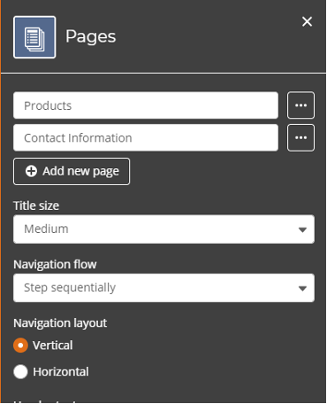
When presenting a paper form, you are asking users to fill in all the required and optional information. Often, the form will be long and contain many areas for input as this is the single chance to collect information. However, by using the Pages feature on Nintex Forms, forms designers can break up sections of forms and present the required fields only when needed.
For example, a Purchase Order form can contain a substantial amount of information about products – including purchase price, dimensions, and even an image. To complete the purchase order, we also need to collect the contact information of the user. To reduce the amount of content shown on the form, you can create a new page dedicated to collecting the user’s contact information.
By breaking up the form into logical components for product information and user information, you can create a better user experience that does not have to mimic your paper-based form.

Building for the right audience
The ease of use when building Nintex Forms can bring an explosion of opportunities to offer forms to new audiences and bring many manual processes to the digital age. As they introduce more forms to a greater audience, whether they are internal users or external customers, form designers must consider the verbiage used on their forms. When adding field names for users to import data, what you name the field is just as important as where you place it.
Form designers should approach the naming strategy of the data requested as if they are presenting the form to a brand-new user.
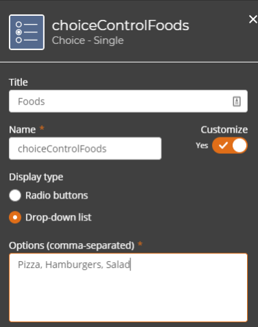
When adding fields, Nintex Forms allows you to configure the name of the control in two areas.
The first area is the title of the control that is presented on the form for user consumption. If you are following a strict naming strategy for naming fields at your organization, you can also use the Name configuration, which follows the control title by default but can be changed to follow your internal naming strategy for building form rules or for start event data.

Nintex Forms rules! No, really, do not forget to use Nintex Forms rules
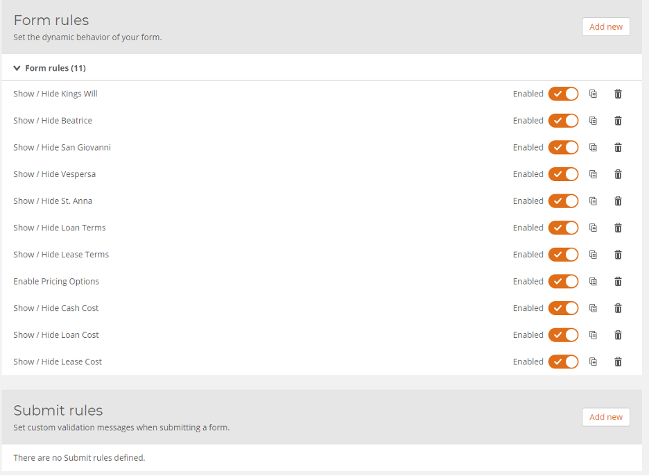
Speaking of form rules, one of the most powerful ways to rethink how users interact with forms is by utilizing form rules to show or hide individual or groups of fields based on how a user is interacting with their form.
For example, let’s say a user was to choose a meal to purchase with the options of breakfast, lunch, and dinner. If we want to present a better user experience, we should only show the food options that are available based on the meal type the user selected. This is possible using the Nintex Forms rules engine.
Nintex Form Rules come in two different methods, form rules and submit rules. Form Rules are dynamic rules that change the way a form will present itself based on how a user interacts with the form. Submit rules allow form designers to set custom validation messages on controls to ensure the correct data is collected when a user submits.

To get a better understanding of Nintex Forms for Nintex Workflow Cloud, go to the Nintex University and enroll in the Workflow Complex Forms – Nintex Workflow Cloud module!
For great examples of Nintex Workflow Cloud forms using rules and the above design concepts, go to the Nintex Process Acceleration Gallery and browse Nintex Workflow Cloud templates!
If you’d like to learn more about process mapping and automation, get in touch with the team at Nintex today. Or if you’d like to test-drive the Nintex Platform free for 30 days, start a free trial.


