With more than a billion and a half web sites to choose from and a combined total of nearly five million apps across mobile operating systems, creating experiences that captivate users, keep them on your site or app, and keep them coming back, can mean the difference between your property becoming the next Netflix or just another also-ran.
Business apps are the latest to jump into the rising user experience (UX) tide, and legacy players and innovative startups alike are all tooling their products around a better user experience.
In our latest webinar installment, “Embrace Modern Web Design,” we briefly discussed Salesforce’s reboot of its Communities product into Experience Cloud to better align its products across the enterprise and offer a more consistent UX.
We also demonstrated how you can use Nintex Apps for Salesforce, formerly known as Skuid, to incorporate some of the latest trends in modern app design and usability into your Salesforce Experience Cloud in just minutes and with little or no additional code.
In the next couple of sections, we’ll discuss five of these web design trends and how you can easily build them into your existing properties. But let’s first dive in with a short discussion about four things to keep top-of-mind when designing any digital property.
The four pillars of application design.
When it comes to building digital solutions, there are four things every application and solution needs to offer.
Utility: Whatever you’re building and for whomever you’re building it, it has to work. It needs to help end users accomplish their tasks to reach their goals. If a business app designed to consolidate multiple data records into a common interface that can be manipulated and edited takes too long to load, it’s not worth much to users.
Efficiency: A basic tenet of accessibility is the idea that an app must be easy to use. Efficiency means that end users can perform their tasks more quickly than the alternative solutions available.
Clarity: How quickly can end users see and understand how the application works? Users should be able to use it without training or a user manual. A well-designed digital solution should be tested by users with a wide range of experiences, backgrounds, and skill levels.
Delight: All three of the previous characteristics can be summed up by this one thing—did the user walk away with a positive overall feeling? Just looking at the app should inspire a user’s confidence in both the tool and the organization that crafted it for them. Delight is what brings users back to the application, and it’s probably the single most important factor in an app’s longevity.
Now, with our firm base of application design principles in mind, let’s take a look at five of the most popular modern app design and UX trends you can incorporate into your Salesforce business apps quickly and easily…
Five popular trends in modern application design
These recommendations come from our community of Salesforce Admins and developers, as well as the Nintex team. A few of these represent some new functionality and trends, and a couple of them are old favorites.
DYNAMIC COLORS
Dynamic colors is a combination of interaction-based color responses, with the eye-pleasing variety of shading, gradients, and shadowing, making elements in your apps fun to use and interesting to look at.
Here are a few of the ways you can use coloring dynamically in your apps:

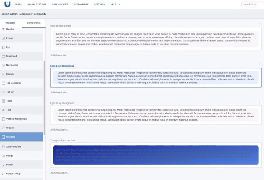
In the Design System Studio, quickly create multiple variations of Nintex components such as text inputs and buttons without having to create entirely new elements for each desired state.
Here, you can create and configure borders, colors, shadow, fonts, without needing to write any CSS/HTML.
Adding dynamic colors to elements in your apps makes them more visually interesting, and provides mental cues that the application is working and recognizing the user’s interaction with the on-screen elements.


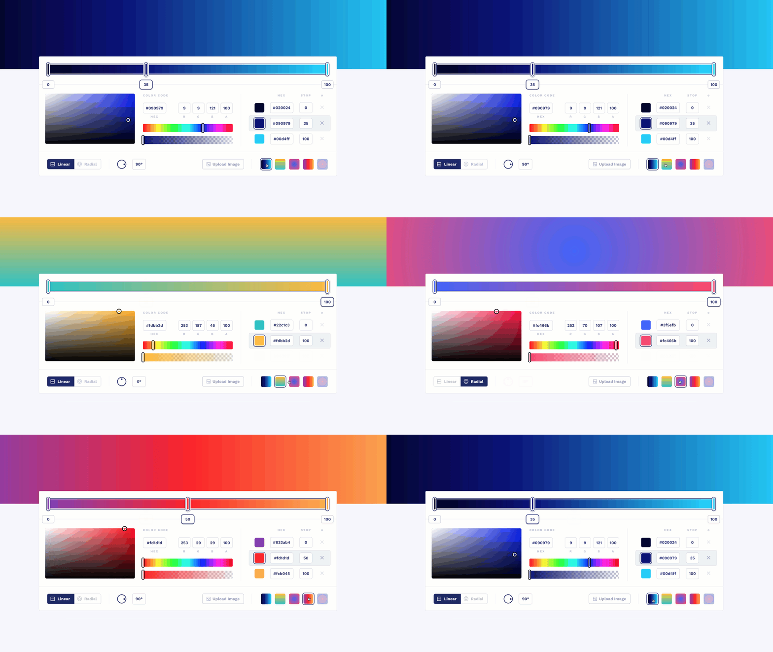
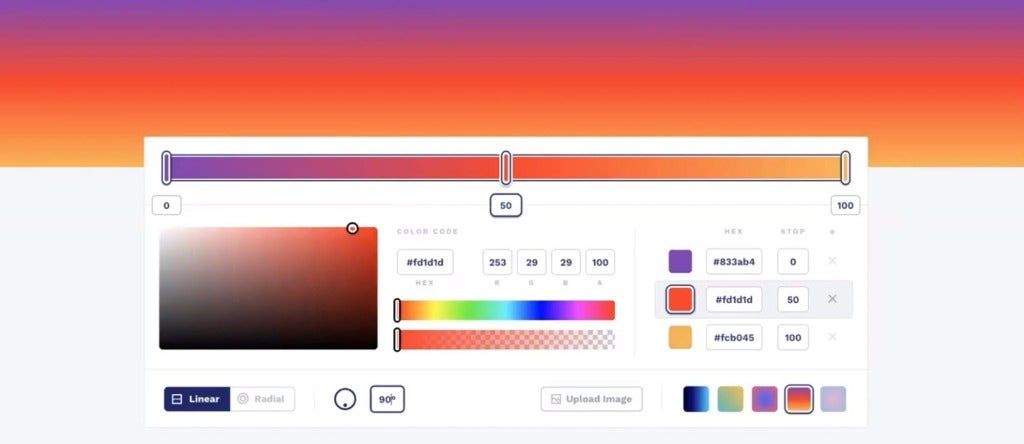
What was old is new again; but this time, working with gradients offers an almost unlimited choice of colors and a dazzling array of options designed to make your brand pop. Here, we’re using a third-party application, CSS Gradient, to create a new gradient color using the linear-gradient definition that was generated from CSS Gradient.
Writing for UX
We’re not suggesting you add paragraphs of text to your apps. Rather, it’s making the copy in your apps as conversational, human, and as interesting, as possible, enhancing the user experience.
Interested in learning more? Request a demo today.


