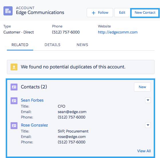
Related lists are one way that Salesforce’s powerful data modeling informs the structure of your application. An admin can create a custom object called “Sales Order” that looks up to the standard Account object, then with a click of a button they can show that list of Sales Orders on the account page. Now, the end-user can access that related information in one place. And there’s more – to get the most out of your Salesforce data model, your admins and devs are going to leverage capabilities like junction objects and quick actions. A strong data model makes for more accurate reporting, more informed selling, and countless other benefits to your organization.

But that’s where the power of Salesforce’s out-of-the-box tools starts to turn into complexity that’s expensive to maintain. The more complex your data model, the harder it is to navigate. You’re often stuck between two options: force your user to accept multiple page loads as they navigate through your Salesforce app, or build something out with custom Lightning code.
As we have worked to make Nintex Apps for Salesforce, formerly known as Skuid, better and better, we’ve tried to listen to the requests of Salesforce admins to find out how we can help you extend Salesforce to get the power you need without sacrificing user experience, reportability or cost-to-maintain. Here are some ways that you can use UX best practices to build on top of Salesforce’s excellent data modeling capabilities. The result will be powerful, easy-to-use related lists in your record pages.
Make your Salesforce related lists more actionable.
UX principles like the Doherty Threshold and the law of common region are important to consider when you’re trying to drive user adoption. The easier it is to see how information and actions are related, and the quicker your users can get to the action they want to take, the more they will use your system, which will improve your data quality.
One of the features most often requested by Salesforce admins is the ability to add quick actions to related lists in Lightning. Try this in Nintex using buttons and our Action Framework to make related lists where the user can do what they need to do where they need to do it. In the screenshot below, we’ve got a Nintex related list for Salesforce tasks where the user can perform multiple important actions in one space. Conditional logic determines which buttons display; here, the user is seeing five buttons that only show if the parent account is a current customer:
Nintex lets you call all kinds of actions, whether a UI change like a popup or something on the backend, like an approval process in Salesforce.
You can call these actions from a button, or trigger them from a user interaction. Here, we’re going to create a row and then open a popup that incorporates the form design we set up:
In addition to buttons and actions, we want this related list’s data to be more actionable for our users. For task management, users will want to update date fields inline for scheduled tasks, or update a status when the task is complete. This is another place where admins often get frustrated, since the only options for Salesforce related lists are to either accept the edit popup experience or build out a custom component with Lightning code. Using Nintex Apps for Salesforce, we can make Lightning related lists inline editable. What’s more is that you can do that for any field in the table, including long text fields. Here, users can edit task descriptions inline:
Finally, one request admins hear again and again is for the ability to easily export data from a list. We want to keep data in our system, but there are times when users simply want to do some quick work in a spreadsheet, and we can give them that option in a Nintex Table using our native table export functionality.


