Home|Nintex Blog|Create beautiful charts with Skuid

Create beautiful charts with Skuid

This post discusses the appetizing uses of the pie chart and its delightful relatives: the donut and the funnel (oddly these are also reminiscent of things you’d find in a kitchen). For good measure, we will also discuss the pyramid, which in some cases also relates to food. Weird. But here goes.

Get it while it’s hot
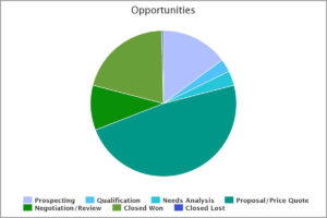
Graphic: Sample of a Skuid pie chart.Pie charts reveal part-to-whole comparisons for a given time period. You may want to use a pie chart to show support calls by category in a given year, or revenue by customer in a given quarter. Pie charts can show slices of data with actual quantities or by percentage. When each slice is relatively large, pie charts work well.

When there are numerous small slices, reading the chart can become difficult. So use a standard pie chart only when a user can visually assess each specific value. You should have no more than seven. Nothing is as disappointing as a small slice of pie (see example below), unless it represents Closed Lost opportunities.

Do donuts
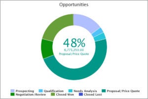
Graphic: Example of a Skuid donut chart.In instances where the pie chart falters, the donut chart can spin circles around it. The donut chart is essentially a pie with a hole in the middle, yet it can present surprisingly more categories with greater clarity.

In Skuid, we use the donut hole to display values when you mouse over a category section. This mouseover display makes it easy to quickly scan a data set for trends, making sure you can savor every delicious bite of information.

Make funnel cake
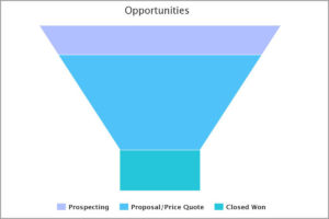
Graphic: Example of a Skuid funnel chart.Creating funnel charts is a piece of cake with Skuid. The funnel demonstrates how well your narrowing or filtering processes are working. The slices of your funnel represent chunks of data by process phase.

Think of the inbound marketing cycle: at the top of the funnel, you would typically see a large number of unqualified leads. In each successive stage of the lead-qualification process, you would then see fewer numbers of leads as your unqualified leads transition to opportunities and, eventually, closed deals.

Dream up a pyramid scheme
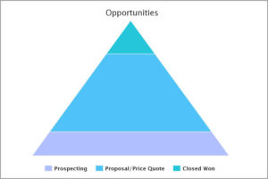
Graphic: Example of a Skuid pyramind chart.Pyramid charts are the kings (or the pharaohs) of demonstrating hierarchy and dominant/subordinate relationships. The top of the pyramid represents a smaller data group and the bottom of the pyramid represents a much larger data group.

You can use a pyramid to demonstrate dominant customer sectors, buyer roles, or types. An eye-opening exercise is to show two pyramids next to one another: one showing the number of customers in each sector, and the other showing revenue amounts in each sector. If this blog post made you hungry for more, get a free trial of Skuid’s Salesforce app!

Request a live demo
See how you can manage, automate and optimize your business processes today ‐ get a demo from one of our experts.
Why Our Customers Trust Nintex on

Please wait while form loads...

Couldn't load the form.

Please disable your ad blocker or try a different browser. If you continue to experience issues, please contact info@nintex.com