Visualizations dramatically improve data cognition. The right chart, table, or graph can make reams of data sizzle with satisfying communication power. Like a high-torque drill, visualizations can cut through your big data fast and clean.
As with any power tool, it’s important to use visualizations with the utmost skill and care, choosing the right charting tool for the right purpose.Consider the humble bar chart, used to display different sized bars in columns corresponding to values on two or three axes (axes is plural for axis, not a large tomahawk).
Column charts are quite handy for displaying revenue by fiscal quarters. Just choose a time-period for one axis and a dollar amount for another axis. Pretty basic stuff, which is why the column chart is a go-to visualization for many folks (and often overused).
Column charts work with just about any kind of dataset, especially those where you need to measure a specific quantity over time (revenue by quarter, for example) or by a category (revenue by sales rep).

Bar charts can be displayed as columns or rows (vertical columns or horizontal bars). Columns work best to demonstrate performance over time. Horizontal bars can be quite helpful in displaying “swim lanes” when comparing performance of similar entities.
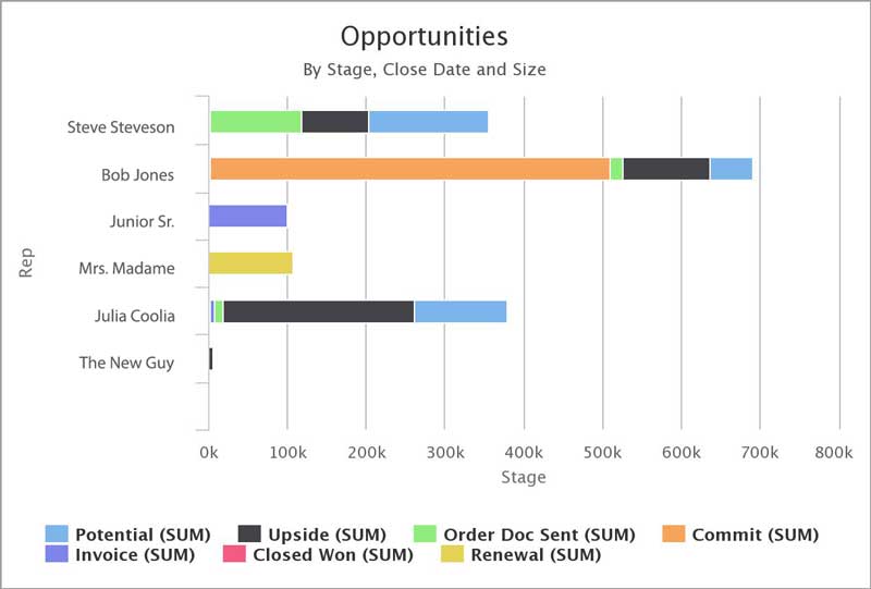
For example, you can use a horizontal bar chart to display revenue by sales reps in a way that looks like a race across the page. Not sure which to choose? Try both and see which works best in your case.
Toggling back and forth is easy to do with Skuid. The simple choice between columns or bars can be very impactful. But to really increase communication and cognition power, consider “stacking” your data like the previous chart.
Stacked bars display part-to-whole relationships across multiple categories. For instance, you can create a stacked bar or column chart to show total revenue by rep or by year, while also displaying different deal stages or types of revenue.
This way, you can see the product types that contributed most to the total. Stacked bar charts reveal key growth characteristics that can signal a need to encourage or discourage a trend. Some folks can feel intimidated by visualization choices. But with Skuid, it’s simple.
Just drag and drop, choose your criteria and types, experimenting as much as you’d like. For the next few posts we’ll re-introduce you to several visualization types and how to use them wisely.
We may even introduce some exciting new types you’ve never used before. All of these visualizations are included in the latest version of Skuid. Want to start creating beautiful visualizations? Get a free trial of our Salesforce app today!


